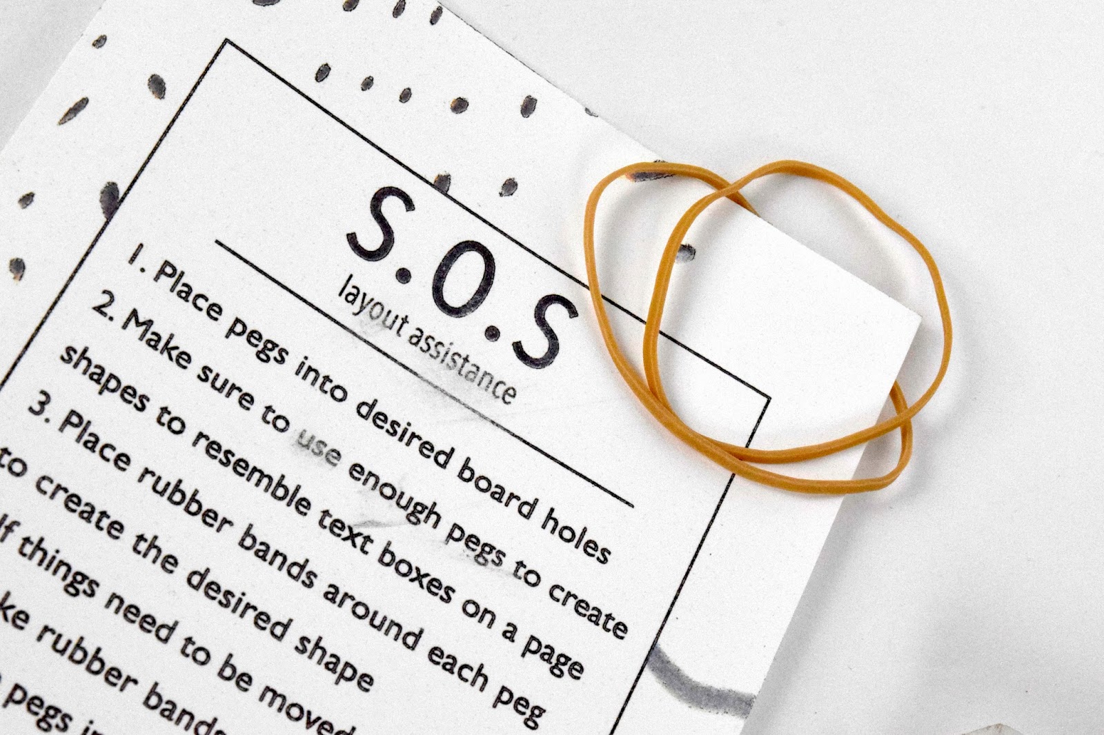
The next project for Type 3 we had to design a product that people (student designers) could use to learn about a specific part of typography / typesetting. We were supposed to choose an aspect about type that we necessarily did not know ourselves / something we could have used when learning to typeset The Exegesis. After typesetting The Exegesis, I realized my biggest issue was margins and layout design. So, I teamed up with Brooke Cirone to develop a product that people can play with to help view text boxes in a manipulative and creative way. This helped me understand spatial value, and understanding that layouts don't just have to be boxes - they can be any shape you please. We also had to develop packaging, I wanted to create a box with a sticker to show the branding - but time and costs became a big issue. We chose a clear holder to hold all of the materials in that could essentially be packaged the way it came, with a handy dandy holder to place materials and can be easily stored when not in use.


Comments
Post a Comment