We had to typeset the Exegesis of Philip K. Dick and professionally print them through Blurb. For presentations we had to write a brief, one paragraph summary of our approach to the book and cover.
This is what I wrote:
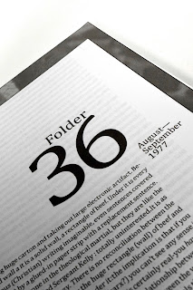
The approach to this book reflects one of minimalistic properties. I chose one column to create a flow throughout each page and stay consistent throughout the book. Each verse is placed on the outer left of the column corresponding with the paragraph it is tied to, appearing like folder tabs (as folders is the main theme). This is reflected in the cover of the book as well, where the treatment of the prepositions are also placed on the left hand side and flipped sideways like the verses in the text. Each chapter page has a border with a chosen image that is blown up to achieve an eerie effect. I also chose this approach because for each cover page, it seems as though the black is infecting the white through different ways, achieving the overall point of the Form I & II in the story, and my sculpture. I also chose to represent this within my cover - the front being mostly white, with black strokes across the page, and the back being mostly black. I decided to use Wingdings for a “page” icon for the page number in the bottom right hand corner, and then a “folder” icon in the upper left hand corner for each chapter - helping the reader remember what folder they were in while reading. Overall - the book is consistent, minimalistic, and treated with folders in mind.
In review/reflection:
I was disappointed in how the margins came out. I was pretty excited about professionally printing this book, and waited in anticipation for it to arrive. But when it did, my heart sank from a few different things. I guess I set my margins way to close to the top and bottom, which makes reading very uncomfortable and the layout uneasy. It fits with the text of the book - which was what I was trying to go toward - but ended up just being way too off. Another thing I was unsure about was my page layouts. I had solid text blocks on each page with no real differentiation. I took this assignment as a typesetting project, so I set it up as one. But seeing other people's layouts with dynamism, I felt remorseful in how I decided to set up the book. These things were my fault and I wish I had gotten more time to spend with the book overall to make a better document. One other disappointment I had was one of Blurb's printing quality. Each chapter page has an image around the page, but on the right hand side there is a crooked white line down it that is off from printing and cutting of the book. I also wish the image quality was just better in general. I wanted to produce another book for this class that dealt with these issues, but time restraints from other projects I had to complete were looming over me and I did not get the chance. But hopefully I can touch this up over the winter break!


This is what I wrote:
The approach to this book reflects one of minimalistic properties. I chose one column to create a flow throughout each page and stay consistent throughout the book. Each verse is placed on the outer left of the column corresponding with the paragraph it is tied to, appearing like folder tabs (as folders is the main theme). This is reflected in the cover of the book as well, where the treatment of the prepositions are also placed on the left hand side and flipped sideways like the verses in the text. Each chapter page has a border with a chosen image that is blown up to achieve an eerie effect. I also chose this approach because for each cover page, it seems as though the black is infecting the white through different ways, achieving the overall point of the Form I & II in the story, and my sculpture. I also chose to represent this within my cover - the front being mostly white, with black strokes across the page, and the back being mostly black. I decided to use Wingdings for a “page” icon for the page number in the bottom right hand corner, and then a “folder” icon in the upper left hand corner for each chapter - helping the reader remember what folder they were in while reading. Overall - the book is consistent, minimalistic, and treated with folders in mind.
In review/reflection:
I was disappointed in how the margins came out. I was pretty excited about professionally printing this book, and waited in anticipation for it to arrive. But when it did, my heart sank from a few different things. I guess I set my margins way to close to the top and bottom, which makes reading very uncomfortable and the layout uneasy. It fits with the text of the book - which was what I was trying to go toward - but ended up just being way too off. Another thing I was unsure about was my page layouts. I had solid text blocks on each page with no real differentiation. I took this assignment as a typesetting project, so I set it up as one. But seeing other people's layouts with dynamism, I felt remorseful in how I decided to set up the book. These things were my fault and I wish I had gotten more time to spend with the book overall to make a better document. One other disappointment I had was one of Blurb's printing quality. Each chapter page has an image around the page, but on the right hand side there is a crooked white line down it that is off from printing and cutting of the book. I also wish the image quality was just better in general. I wanted to produce another book for this class that dealt with these issues, but time restraints from other projects I had to complete were looming over me and I did not get the chance. But hopefully I can touch this up over the winter break!


Comments
Post a Comment