
Semiotics Learning Summary

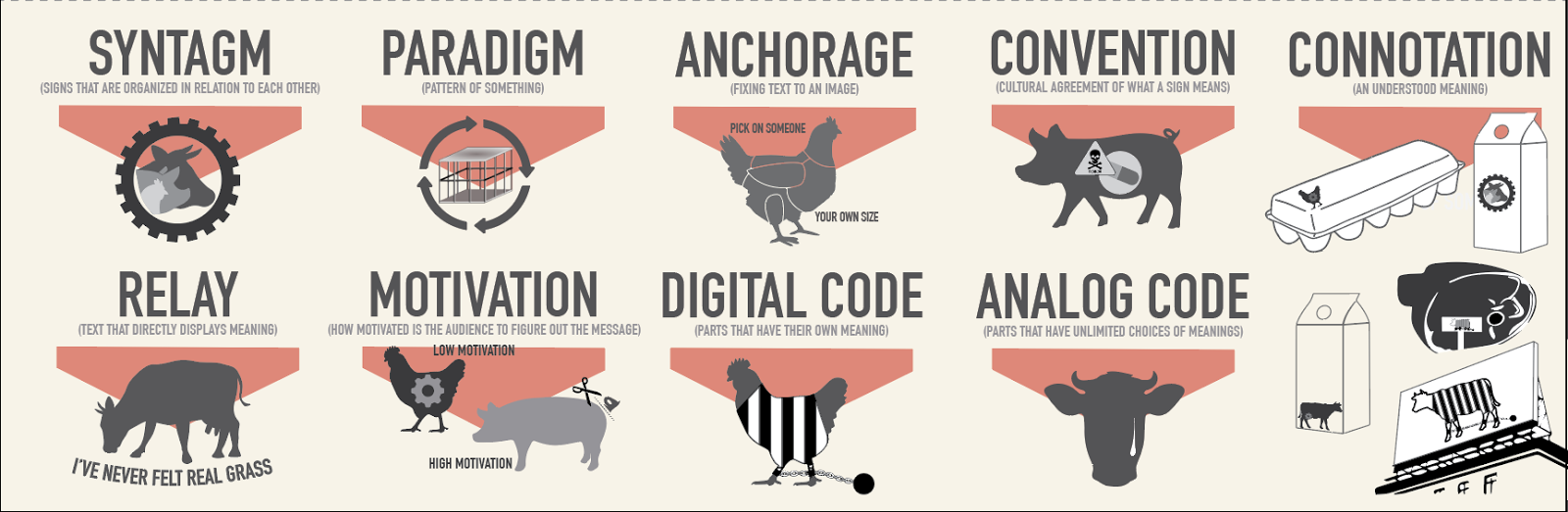
I chose Factory Farming as my social issue for our lesson in semiotics. Our first assignment was to collect statistics and figure out our representations. This is on another blog post but I will place it again below:
Social Issue: Factory Farms
Iconic Representation: Animals, cages, bars, overcrowding
Statistics: 
1. A typical supermarket chicken today contains more than twice the fat, and about a third less protein than 40 years ago
2. Hog, chicken and cattle waste has polluted 35,000 miles of rivers in 22 states and contaminated groundwater in 17 states.
3. Egg-laying hens are sometimes starved for up to 14 days, exposed to changing light patterns and given no water in order to shock their bodies into molting. It’s common for 5% to 10% of hens to die during the forced molting process.
4. According to one study, 65 percent of all hogs tested had pneumonia-like lesions on their lungs. Researchers believe this is due to ammonia and other gases released from the massive amounts of manure that the animals come into contact with every day.
5. In 2009, Mercy For Animals went undercover at a Hy-Line Iowa egg factory and discovered that baby chickens who were of no egg-laying use to the buyers (read: male chicks), were put on a conveyor belt and sent directly to a grinder.
6. Many dairy cows living in factory farms are sent to slaughter before they reach the age of five. Though cows can naturally remain productive for 12-15 years, the intensive conditions of industrial dairies can take a toll on their health.


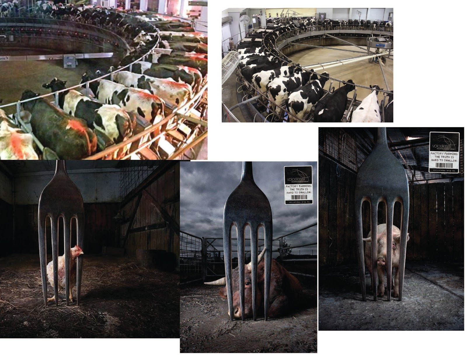
Next step, we collected images / pre-existing symbols for our social issue which I provided below:


I decided to place these within my notebook and add notes / doodles to get started on the creativity!
(I have to scan these in later)


Then I chose certain ones to "finalize" - this part I wanted to take these into illustrator because I knew I wanted to go with a very graphic look.


From the beginning of collecting my research I found I was more attracted to infographics, so that's the route I wanted to take with my final poster. Final poster was 36in x 48in.


Comments

Popular posts from this blog

Type Critique: Kelsey Mack

Critique on Kelsey Mack's type project: Instantly the waves of type grabbed my attention. Some waves stay consistent throughout the piece, all forming the same waves through each line of type. Some of the words are changed to a different typeface, which some are very successful in pulling out information like the word Kremlin 's scale and bold typeface instantly draws my attention there. There are some issues with letter spacing, like the word "Kremlin" the r and e are very close together which i'm sure is because of the curve it sits on but kerning could have helped. Some of the shifted typefaces / scale of type overlaps other type, creating irregular spacing - i'm not sure if that is a right design decision because these hefty holes in the body feel erratic. Some work well though, the  "oh" covers up the text above nicely. Curvilinear lines aren't exact, for example the spiral on the bottom seems to have ridges in it, not a nice smooth curve ...

Gestalt: Final

This post is going to be combining a few different class days in Visual Communication I. Wednesday 9/7 : We toured the Print Shop and got our information to print our final version of our Visual Order: Gestalt books. I did not get a desk crit with Emmy that day. Monday 9/12:  I was absent this day with a doctor's note, but I sent my mockup to Emmy, while others brought their printed mockups to class for group critiques. Wednesday 9/14:  This day we started our new project Monday Prototyping, which has it's own blog post. For Gestalt, I wanted to make this note to place the feedback I got on my mockup. Tyler Make body text lowercase. Words in capital letters have the same shape (a rectangle) so, they’re harder to distinguish Rethink horizontal lines, everything is already distinguishable in their own space Rethink border around both left and right side How to make everything more related First few pages have block behind text, but not the rest Emmy Too s...

Type 3: Sculpture

I wanted to focus on the main "Form One" and "Form Two" part within the reading. I decided to take two spherical shapes and have one be smaller as the underdeveloped twin and fill it with black ink. Both spheres have smaller orbs inside them signifying lifeforms. In the underdeveloped one, the orbs are drowning in black ink. Around the pedestal that Form Two is sitting on, there is black wire coming out of the bottom and winding upward as if it is attacking / trying to infect Form One hanging above. Form One I decided to leave clear with bright orbs inside with a tiny red / pink flake that can be seen if you look closely. These are just some of the images I took that I wanted to add to the blog, I have a lot more but I didn't want this post to be super long.