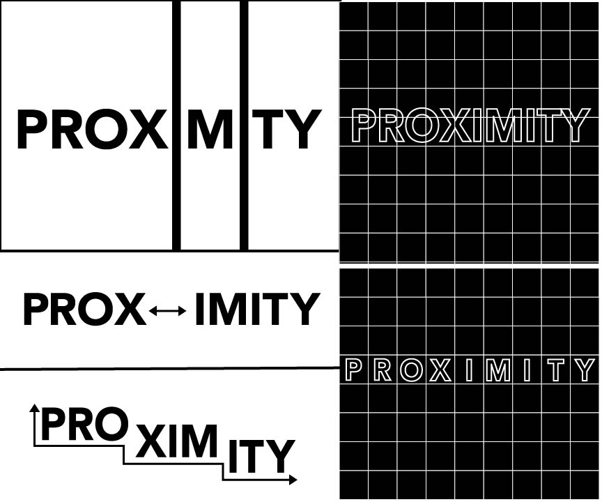
This is from class Monday 8/29. We had to create typographic versions of four Gestalt Principles we learned which are: similarity, proximity, continuity, and closure. We had to make 5 variations of these principles in illustrator to explore verbal visual meaning through breaking up the letterforms.
After that we also had to do one more iteration of each constructed image in our chosen theme. After critique it was still hard for me to decide what to do. Everyone said they liked my pill images more than anything, but last year I worked with pills as my medium for a few projects, so I wanted to do a subject matter that was new to me. For the four iterations I went ahead and did the "link" downtown, but I changed my theme later. Anyway, those four pictures are added as well underneath my typographic versions.


After that we also had to do one more iteration of each constructed image in our chosen theme. After critique it was still hard for me to decide what to do. Everyone said they liked my pill images more than anything, but last year I worked with pills as my medium for a few projects, so I wanted to do a subject matter that was new to me. For the four iterations I went ahead and did the "link" downtown, but I changed my theme later. Anyway, those four pictures are added as well underneath my typographic versions.


__________________________________________________________________________
Similarity

Closure

Proximity

Continuation

Comments
Post a Comment